Masters Final project
Through my Masters in Web + UX/UI Design, I developed my understanding of UX principles and research, and developed my skills with tools such as Figma, WordPress, Elementor, Whimsical, Notion and Framer.
Final project: Using the double diamond design process, create a product that helps people swap clothing in an accessible, brand-conscious way.
Results
Final grade of 90/90 (Highest possible)
The brief
Answer the question: “What would an app that helps people swap clothes look like?”
Use the Double Diamond design process to discover and define the problem, and develop and deliver a solution
Take on the research, brainstorming and wireframing process individually, focusing on accessibility
Develop a clear, but simple brand direction for the digital product
Design and prototype two key functionalities on mobile and a landing page on Figma
Test the product with potential users and suggest iterations
“For me the first part of the diamond is about questioning the brief and defining the problem statement. I explain it as ‘designing the right thing’. The second part of the diamond is about exploring possibility, iteration, testing and developing, so ‘designing the thing right’.”
— Anna White
To better understand the issues around clothes swapping, circular fashion and second-hand shopping, I undertook the following activities:
Desk research
Netnography
Research Questions
Questionnaires
Interviews
From here, I gathered that sustainability, cleanliness and brand-consciousness were key aspects of the potential app.
Phase 1: Discover
With some ideas forming, we got on to synthesizing the information to gain more accurate insights. To do so, I did the following activities:
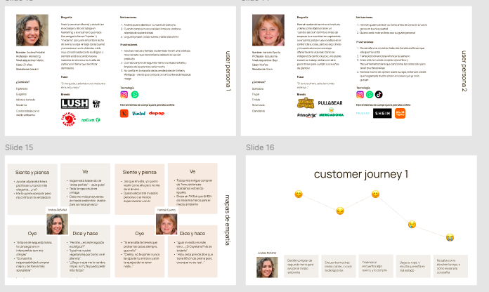
User personas
Customer journeys
Empathy map
Needs matrix
Honing in further, I realised the users’ main pain points were: insincere selling practices, high risk in second-hand shopping, low branding efforts and difficult shopping experiences.
Phase 2: Define
Now, with our audience’s pain points clearly defined, I started thinking of how we could actually help them. I did so via the following activities:
Solidifying our findings and insights
Brainstorming solutions
Card sorting
Usability-Viability Matrix
In-out functionality Matrix
MoSCoW model
From these activities, I decided to build an app with a real quality-control centre, whereby users can send in their clothing, have it be tokenized by an independent team, and then have a safe, fun e-commerce experience without the pitfalls of C2C shopping.
Phase 3: Develop
Now, clear about what was being designed, I hopped into brand design. I created the company name Reviú, a Spanish twist on the word “review”.
The objective with the typography, colour selection and logo, was to create the following brand personality: fresh, modern, elegant.
Phase 4: Design
Onboarding
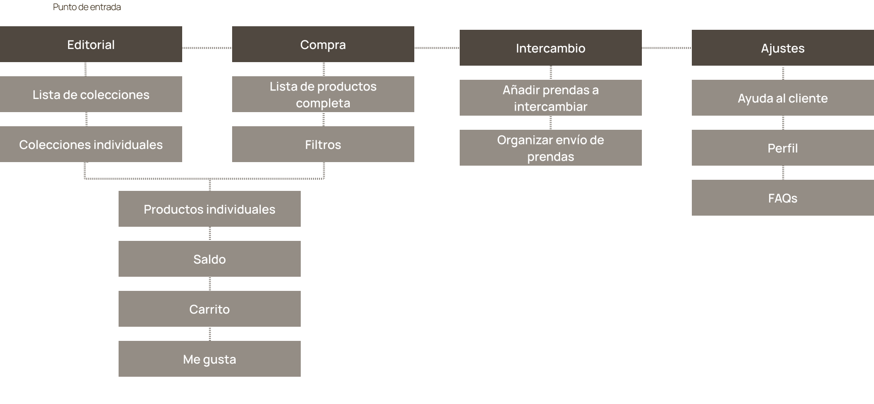
Sitemap and User Flows
Wireframing
Mobile design
Landing page design
Using the platform Maze, I set out 10 users on app-specific tasks to test the usability of the product. In doing so, I developed the following insights:
The onboarding is simple and easy to understand. All users reached the end and understood the app.
The fact that there are two ways to reach the exchange area is positive, as 50% went to the coin icon, and the other 50% clicked on the icon in the footer navigation.
The purchase icon on the individual product screen only appears when the user drags for more information. Not everyone understood this, so it could be reworked.
The + button was confusing – it could change to a purchase button and one for adding to favorites.
The cart button is too small and leads to misclicks.
Getting to know the user
“I think it's really great! The idea works very well in the app. It's very intuitive. The design is easy to use and very elegant.”““The design is very clear and intuitive. I like more color over minimalism, but overall I think it's really good. The idea seems original and practical to me.”“I loved it! Very easy, intuitive, colorful, and beautiful :)”


